Gmail have updated the UI, and quite frankly I hate it!
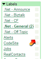
It feels cluttered with the silly boxes in the Labels section

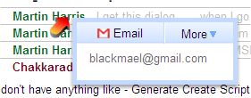
But the icing on the cake is the in your face push for chat. When reading mailing lists, the UI was the good thing about Gmail, you could click on each item and read things in a nice orderly fashion. But the new UI now pops up a Chat window on each person. So now you can’t read the first line of the email.

It’s so crap I turned on the keyboard shortcut so I would trigger the UI crap-ness, but that’s got it’s own crap-ness because it jumps around, and it’s disconcerting. I like my scroll wheel. I like collapsing read emails. I don’t like pop-up UI.
Likely there is an option to revert to the old UI,

Ahh, the feeling of calmness is returning. If Google switches to the new UI permanently, I’m going to have to leave them, and that’s annoying… because they were good.
Why the big push for chatting via the browser? Where is the setting “I use gtalk, so just piss off with breaking the email application trying to do poor chat“ tick box?
