This may be long, but at the end of the post, you should be able to change the look of any WPF control.
I have a Win32/WFC application that I’m porting to .Net/WPF. It is a simulator, so has lots of values to set/tweak. The current application has lots of GroupBox clustering options together, yet most are only needed some of the time (like before starting), and some options should only be used if other options are not.
With this in mind, I wanted to be able to expand/collapse groups.
My first attempt was to add a button to the header of a GroupBox, and in the code behind alter the Visibility=”Collapsed”, but that felt clunky.
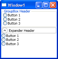
I then found the Expander control, which does exactly what I want, yet as a UI control I find it ugly. I guess it is good for building Outlook tool panels. This is where the power of WPF shines. I can take the expander and give it a new skin and make it look like a group box, but keep the boarder visible while the content is collapsed.

The first place I looked was is MSDN, and tried the Expander ControlTemplate example, but the theme was completely different from the normal theme, and that was what I was wanting to capture.
So I then asked on the NZ .Net mailing list, and Ivan came up with some helpful options:
- Use Expression Blend 2
- Use the BAML Viewer Reflector add-in
- or try MSDN under Controls > Control Customisation > ControlTemplate examples (the above example)
So I tried the idea’s in exciting order first, aka Reflector and the BAML Viewer. In short this was the wrong choice, here’s why, it took me ages to find that I needed to look at the correct DLL:
You will need to open one of the theme DLLs, e.g. PresentationFramework.Luna.dll or PresentationFramework.Aero.dll (use Open Cache since they are in the GAC) - Ivan
Once I had the correct Xaml, I realised that the internally referenced static resources were not named correctly, therefore you could not tell what was used where. That was a deal breaker.
So I then turned to what I thought would be the trickiest option installing and using Expression Blend 2.
First wrong assumption was, that it was now released and thus I’d need a license. It’s still in development, so is still free. It was also small (compared to Visual Studio installers) at 25MB.
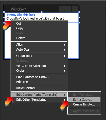
Once I got Blend installed, changing the look of controls is SO EASY:
Add the control you want to copy the look of, to the design surface
Right click on the control
Click Edit Control Parts (Template)
Click _Edit a Copy

How to copy a WPF control’s controll template Save as something.xaml
Add the control you want to change to the design surface
Repeat steps 2 - 4
Save as IntelligentName.xaml
Merge the two templates to give you the desired look/feel/interaction
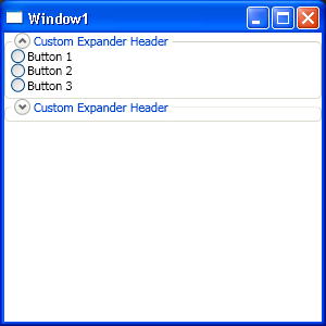
After having done this I ended up with a Expander that looked like a GroupBox

You just add
Style="{StaticResource GroupBoxExpander}"
to your Expander, and I also tend to set
IsExpanded="True"
The code for the GroupBoxExpander.Xaml is at end of this post. Remember to include the ResourceDictionary in your App.xaml via a Merged Resource Dictionaries
Some things I learnt on the way:
There are some quite clever uses of a Grid, to get the Board half way through the text of a GroupBox
I really like WPF’s separation of concerns
I quite like typing Xaml by hand
  <ResourceDictionary xmlns="http://schemas.microsoft.com/winfx/2006/xaml/presentation"
  xmlns:x="http://schemas.microsoft.com/winfx/2006/xaml">

  <Style x:Key="GroupBoxExpanderToggleButtonStyle" TargetType="{x:Type ToggleButton}">
  <Setter Property="Template">
  <Setter.Value>
  <ControlTemplate TargetType="{x:Type ToggleButton}">
  <Grid SnapsToDevicePixels="False" Background="Transparent">
  <Ellipse HorizontalAlignment="Center" x:Name="circle" VerticalAlignment="Center" Width="15" Height="15" Fill="{DynamicResource ButtonNormalBackgroundFill}" Stroke="DarkGray"/>
  <Ellipse Visibility="Hidden" HorizontalAlignment="Center" x:Name="shadow" VerticalAlignment="Center" Width="13" Height="13" Fill="{DynamicResource ExpanderShadowFill}"/>
  <Path SnapsToDevicePixels="false" x:Name="arrow" VerticalAlignment="Center" HorizontalAlignment="Center" Stroke="#666" StrokeThickness="2" Data="M1,1 L4,4 7,1" />
  </Grid>

  <ControlTemplate.Triggers>
  <Trigger Property="IsChecked" Value="true">
  <Setter Property="Data" TargetName="arrow" Value="M 1,4 L 4,1 L 7,4"/>
  </Trigger>
  <Trigger Property="IsMouseOver" Value="true">
  <Setter Property="Stroke" TargetName="circle" Value="#666"/>
  <Setter Property="Stroke" TargetName="arrow" Value="#222"/>
  <Setter Property="Visibility" TargetName="shadow" Value="Visible"/>
  </Trigger>
  </ControlTemplate.Triggers>
  </ControlTemplate>
  </Setter.Value>
  </Setter>
  </Style>

  <SolidColorBrush x:Key="GroupBoxBorderBrush" Color="#D0D0BF"/>
  <SolidColorBrush x:Key="GroupBoxHeaderBrush" Color="#0046D5"/>
  <BorderGapMaskConverter x:Key="BorderGapMaskConverter"/>

  <Style x:Key="GroupBoxExpander" TargetType="Expander">
  <Setter Property="BorderBrush" Value="{StaticResource GroupBoxBorderBrush}" />
  <Setter Property="BorderThickness" Value="1" />
  <Setter Property="Template">
  <Setter.Value>
  <ControlTemplate TargetType="{x:Type Expander}">
  <Grid SnapsToDevicePixels="true">
  <Grid.ColumnDefinitions>
  <ColumnDefinition Width="6" />
  <ColumnDefinition Width="Auto" />
  <ColumnDefinition Width="*" />
  <ColumnDefinition Width="6" />
  </Grid.ColumnDefinitions>
  <Grid.RowDefinitions>
  <RowDefinition Height="Auto" />
  <RowDefinition Height="Auto" />
  <RowDefinition Height="*" />
  <RowDefinition Height="6" />
  </Grid.RowDefinitions>
  <Border CornerRadius="4" Grid.Row="1" Grid.RowSpan="3" Grid.Column="0" Grid.ColumnSpan="4" BorderThickness="{TemplateBinding BorderThickness}" BorderBrush="Transparent" Background="{TemplateBinding Background}" />
  <Border x:Name="Header" Grid.Column="1" Grid.Row="0" Grid.RowSpan="2" Padding="3,0,3,0">
  <Grid SnapsToDevicePixels="False" Background="Transparent" Grid.Column="1" Grid.Row="0" Grid.RowSpan="2">
  <Grid.ColumnDefinitions>
  <ColumnDefinition />
  <ColumnDefinition />
  </Grid.ColumnDefinitions>
  <ToggleButton Grid.Column="0" MinHeight="0" MinWidth="0"
  Name="HeaderToggle" Style="{StaticResource GroupBoxExpanderToggleButtonStyle}"
  IsChecked="{Binding Path=IsExpanded, Mode=TwoWay, RelativeSource={RelativeSource TemplatedParent}}" >
  </ToggleButton>
  <ContentPresenter ContentSource="Header" RecognizesAccessKey="true"
  TextElement.Foreground="{StaticResource GroupBoxHeaderBrush}"
  SnapsToDevicePixels="{TemplateBinding SnapsToDevicePixels}" Grid.Column="1" VerticalAlignment="Center" HorizontalAlignment="Left" Margin="3,0,0,0" />
  </Grid>
  </Border>

  <ContentPresenter x:Name="ExpandSite" Visibility="Collapsed" Grid.Row="2" Grid.Column="1" Grid.ColumnSpan="2" Margin="{TemplateBinding Padding}" SnapsToDevicePixels="{TemplateBinding SnapsToDevicePixels}" />

  <Border Grid.Row="1" Grid.RowSpan="3" Grid.ColumnSpan="4" BorderThickness="{TemplateBinding BorderThickness}" BorderBrush="{TemplateBinding BorderBrush}" CornerRadius="4">
  <Border.OpacityMask>
  <MultiBinding Converter="{StaticResource BorderGapMaskConverter}" ConverterParameter="7">
  <Binding Path="ActualWidth" ElementName="Header"/>
  <Binding Path="ActualWidth" RelativeSource="{RelativeSource Self}"/>
  <Binding Path="ActualHeight" RelativeSource="{RelativeSource Self}"/>
  </MultiBinding>
  </Border.OpacityMask>
  </Border>

  </Grid>
  <ControlTemplate.Triggers>
  <Trigger Property="IsExpanded" Value="true">
  <Setter Property="Visibility" TargetName="ExpandSite" Value="Visible"/>
  </Trigger>
  <Trigger Property="IsEnabled" Value="false">
  <Setter Property="Foreground" Value="{DynamicResource {x:Static SystemColors.GrayTextBrushKey}}"/>
  </Trigger>

  </ControlTemplate.Triggers>
  </ControlTemplate>
  </Setter.Value>
  </Setter>
  </Style>
  </ResourceDictionary>
