I upgraded to FeedDemon 2.5 Beta 4 at work, mainly for the cos I can factor, but a little bit for the better embedded video support. But the features that I actually like the most are two UI tweaks.
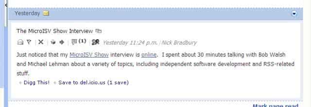
- When you click on an item in the news panel, it gets a light blue border now. It used to colour the whole item’s background light blue, which interfered with the feel of reading.

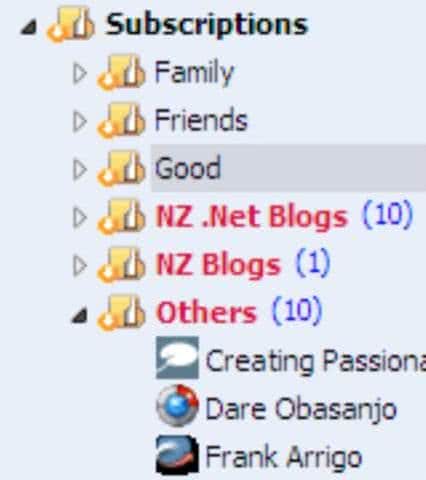
FeedDemon blue board around current reading entry - The subscription tree has cute little triangles for open/closed status of the nodes. It used to used classic plus/minus signs.

FeedDemon cute TreeView icons
So just small things, which make it nicer to use. It feels better, just because the UI is cleaner.
